Monday, October 29, 2018

Printing Processes

Relief Process

Relief process is when an artist uses linoleum or wood and carves into it to create a print. You start by creating a drawing on a piece of paper with ink and then transferring that onto the wood or by drawing an image onto a stained piece of wood. After that the artist can use black line or white line composition to create depth in the image. When the wood has been carved you can apply ink to the wood and use it to print onto paper and create images. This process can be helpful for making multiple replications of an image.

Relief Process Print (Obama)


Intaglio Process


In this process you must scratch onto a flat copper plate to create lines deep enough for ink to sink in and create a print when pressed onto paper. Firstly, you must prepare the plate by cleaning and polishing it and then preparing ground to protect the areas of the plate that hold ink. After preparing a ground on the plate it is jet black and you can scratch the surface to reveal the plate and create your design. After that you etch the plate by placing it into a bath of acid to create deep troughs that will hold the ink. It is taken out and the placed back in. After the plate has gone into the bath it is ready to be inked and used to print.

Intaglio Process Print (Plant Goddess)


Lithography Process

This process uses a stone that is receptive to grease and water. This stone is very delicate and is a very cool and complicated printing surface. This type of printing process is used especially by writing and news businesses. The grease materials used are lithographic pencils and crayons and that is used to draw directly on the stone. The stone is etched afterwards and different materials like rosin and gum arabic are added to the stone. Afterwards TAPEM is added and gum is added again. This stone is then buffed and a greasy solvent is added to the stone which prepares the drawing and stone for ink. After the surface of the stone is wetted, ink is applied. Ink is then forced into the crevices of the drawing and after multiple times, it is ready for paper.

Lithography Process Print (Lorde, Singer)


Monday, October 22, 2018

Panorama Narrative


Cat's Story


I slowly opened my eyes and immediately closed them again. A light shine brighter than the sun was right on my face and it took me a couple seconds to adjust. I looked up and saw my owner's hand coming down to pet my head. When my owner pulled his hand away he turned around and headed towards the kitchen. I followed right behind him and he poured himself a glass of water and filled up my bowl as well. After that I my owner opened up the back door and I trotted outside into the sunlight which was warm along with the cool wind.

The grass was wet from yesterdays rain. Usually I hated this but today I didn't mind. I walked over to the garden. My owner had been growing flowers for a few months. I leaned down and ate a couple dandelions I found around the flowers. A grasshopper hopped by, but I didn't feel like chasing anything around today. I watched the clouds move and the sky was going gray. It might start raining today. I went and hopped over the fence that was in our backyard and looked on at the creek that was behind our house. I walked passed some sand bottles on the way to the street which I didn't remember seeing yesterday.

I got out to the street and breathed deep. I crossed and started on my usual trail. I always walked around this way and wandered about seeing what I could find. A man sat on a lawn chair on the grass by the street. He had a flame in his hand. I could smell the man lighting a cigarette. When I walked around for an hour or so I found myself wandering into a bush. I smelled around the flowers and laid down in the dirt. Before I knew it I had closed my eyes and I didn't wake up till night had already come. A pretty boring day.


Wednesday, October 3, 2018

Photoshop Pop Art Project


Photoshop Pop Art Project


When I started creating this project I really had no idea where to start. I spent about 5 minute just starting blankly at the screen until I looked up additional examples of pop art and decided to start with adding shapes to my photo. I picked the rectangle tool and added different color rectangles around my project. I made smaller to large rectangles at the bottom to make it look at least a little organized. 
     For the color scheme, I decided to just go with kind of a rainbow scheme. The different color rectangles take center stage in the final photo so I feel that rainbow would be a good describing word. Besides that I had a yellow and tie-dye-ish glow that was pretty prominent in my photo as well. Overall, for most of my project I did not really plan anything out. I just kind of tried different things out until I found a style I thought went well. 
     At first I didn't really look at any artists for inspiration. I was already a bit of the ways into the project when I tie-dye-ishdecided to go back and re-look at the presentation. I realized James Rosenquist was an artist who I really enjoyed and so I tried to somewhat use his work to inspire the style in mine. I liked the randomness and creativity in his work and I just liked his a lot more than the other artists.
     Some of the different tools I used in my project were filters, masks, shapes, pen tool, adjustment layers, and clone stamp. I used the mask in order to get that rainbow background and the pen to create a thick border around my subject which I ended up blurring in order to blend in with the rainbow. I used shapes obviously to create that pop art effect and clone stamp in order to try and get rid of a lot of unnecessary background footage that was in my photo before. I also used filters and adjustment layers to change the overall look and feel of the photo. I feel like I did a pretty good job on this project and I think this was a good project to practice my photoshop skills for future projects. 


Friday, September 14, 2018

Photoshop Challenge #1

    
Photoshop Challenge #1 


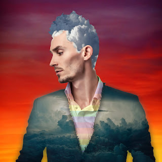
For this photoshop challenge we had to edit a photo we were given of a man. We could do anything we wanted to edit him and create something original. Originally I had the idea to make the man fire themed, but after trying out some image and editing him a bit I realized that probably was not the best idea. It just looked weird and I knew I could do something that looked a lot better. Afterwards, I brainstormed ideas for a new theme I could use to edit my photo. One theme that came to mind was clouds or a sky. I went searching for some images and came out successful. 

     After I found my images I created masks with the quick selection tool over the areas where I wanted to replace my images with. I replaced the suit with two different images. For the outer part I chose a nice sky and clouds photo and for the inner shirt portion I chose a rainbow pattern to kind of go along with the theme of clouds and sky. I did not incorporate many blending mode changes because there were not many I liked for any of my images so I kept in on normal. I did however lower the opacity for the suit so I was still able to see a bit of texture to blend in with the image of the sky and clouds I had chosen. I also chose clouds for the hair and a sunset image for the background. 

     Overall, I really enjoyed this project. It was fun and a great way to incorporate the skills I learned from the tutorials and maybe learn some new ones too. I did not know what it was going to turn out as in the end and to be honest I think I did pretty good considering how well I know Photoshop. I went in to the project thinking I would do absolutely terrible and it was not as stressful as I thought it would be. I like my final image and think it was a good experience to prepare for future graphic design projects.


Tuesday, September 4, 2018

Photoshop Tutorials #1

     
Photoshop Tutorials Project #1

     For this project we followed a series of videos to guide us through the different tools and techniques used in photoshop. Photoshop is a photo editing software that will be helpful for us to use throughout our Graphic design class and into a graphic design career even. In this project we had photos that we edited by following along in the tutorials. In each one we learned new techniques about how to get rid of unwanted background items, removing blemishes, cropping photos, etc. I felt this project was very helpful in teaching us about what we will need to do in this software so we can succeed in our future projects requiring us to use Photoshop.
  
      To be honest, I was not the best at this project. The tutorials sometimes got quite confusing and it was pretty frustrating at times trying to get everything perfect. In the end some of my photos did not look exactly like how they were supposed to according to the tutorials, but I was able to edit them enough to were I was happy with how they looked. The hardest tutorial to follow and photo to edit for me was probably the collage project with the tiffany photo coming in 2nd. Those two photos gave me the most trouble and by the end my photos were far from perfect, but I tried my best and I'm happy or somewhat happy with how they turned out.
     
     Photoshop itself is actually a pretty complex and technical software. I used a small amount last year, but I definitely knew close to nothing about how the software worked and how to edit photos. Now I have a pretty good basis about how to edit photos and I will still have plenty to learn on the upcoming photoshop tutorials as well.


Content Aware Fill

This lesson was probably one of the easiest that I did. We used four different images to practice using this tool. This tool is used to get rid of unwanted objects or background that we can convert to blend in to the background. In the photo that I picked we got rid of many unwanted blemishes and nails on the wall as well some sort of structure that messed up the vibe of the image. It is a really useful tool and I will definitely be using it in future projects.


Patch Tool

This tool was also pretty simple but I also had a little bit of difficulty completing my photoshop tutorial with this tool. In this tutorial we had to use the patch tool to delete a message off a t-shirt that might not want to be seen. By the end we were able to make the shirt look like a solid light blue colored t-shirt. I will be using this tool a lot especially on clothing images or images where I will not be able to use the Content Aware Fill tool.


Clone Stamp Tool

This tutorial was one that I did not fully grasp the hang of. I understand a bit how to do it, but I did not fully understand the video tutorial hence why my photo looks slightly different to the completed image in the tutorial. I understand how to use the tool a bit though, and I was able to use in on some of the other images. I especially used this on my collage portrait image for the sky and branches. 


 Healing Brush

The Healing Brush is a fairly simple tool that am pretty confident using in the future. I was a bit confused while using the tool in the tiffany photo and I don't remember much about it from that tutorial. While doing the photo of the young boy I used the spot healing brush to remove some blemishes and that was definitely a pretty simple thing to do. One of the easiest tutorials in my opinion. I definitely see using this tool in the future if I am trying to edit someones skin or some small blemishes on a photo that I want removed.


Portrait Collage

This was by far the trickiest and longest of the photo shop tutorials that I completed. I think I did pretty well in this tutorial and I think my photo turned out alright, though it definitely could be a lot better just by comparing it to the turnout of the photo on the tutorial. In this part of the tutorial we collaged three different portrait photos together into one photo. I'm not sure of anything in particular where I would need to use this tool, but I am sure that these skills will most likely come to use to me in the future during projects.


Thursday, May 24, 2018

Final Exam Blog Post

Well Plant ~ Product and Presentation

1. Our 4th Quarter Project was the Weli plant. The idea of the Weli plant stemmed from wanting to be left alone or the problem people face of being unsafe or annoyed. The plant is supposed to scare away people so the owner can be left in peace and quiet. We created a website, graphics, animations, and a commercial (video) to go with our product. The company name we decided on was Utilis because of or helpful and useful products. I am happy with our final product and presentation although I do feel we could have done better but I was still happy with what we were able to do. The presentation took a couple minutes in total maybe 5-6 including questions and I thought it was a success and everyone did their parts very well. I don't think there were very many struggles if any present during our presentation so I am happy about that.
This was our Utilis and Weli Plant logos!
    The first part of the product we created was the graphic design portion of our product. This portion probably was the least stressful and took the least amount of time. I created the logo for both the company and product. The other graphics were created by the other team members like our ads and banners. We had plenty of good ideas for our logos which was helpful and sometimes we couldn't express exactly what we wanted into our logos because of our lack of skill in Illustrator or other things. In the end we created designs that we were really happy with. 
This was one of our other logos
that we used on some of our creations
but it's not our official logo.
     The next part of our project was the animation and this was probably the most challenging part of our project. It took a long time to make our SketchUp 3d animations and not so long to create our 2d animations. We were all happy with our 2d animations and originally there were two different 2d animations as well. During the video portion of our project we learned some of the animations were not saved correctly and we were not able to use them. This came with little time left before our presentations and we still needed to finish our videos so we decided to focus on those first. Next time I think we should look out for things like this before we get too far into the project and realizing that we may have to recreate something. Other than that the animations were probably the part of the project that I am least proud of and I think we could have done a lot better.
This was on of our benefits ads!
     The last parts of our project were the video portion. The video part of our project was very interesting and was probably the most enjoyable part of our project to create. We created scripts and thought everything through only to realize we would only be able to use about a four lines of our script in order to make it fit into our timeframe. Because of this one of our team members Grace decided to make another video with some of the other ideas from our previous script. The editing portion of the video project was very interesting and for me personally I enjoyed the video that I created. We had a great video in mind to use during our presentation made by Grace but opted to use one of Jaidyn's videos because it showed a lot more variety in the content and some of the other videos were somewhat repetitive. I did have some troubles in my editing process with the sounds but once we got it all figured out it was good and I was happy with my final video as well as everyone else video they created.
     Lastly, was the website portion of our product and this was what we presented to the class in the end and I thought we did very well in this. Obviously looking at other peoples websites during the presentation I feel we could have done better but I am still proud of my group for working together and getting this whole thing done. The website was done throughout the entirety of the project on the side when we had a chance during our graphics, animation, and video portions. We also had the chance to work on it a lot during the week before the presentations. There were definitely many challenges that we faced during the creation of the website and mostly were due to the fact that most of us were not very good at web design or at least Jaidyn and I who were working on the website portion. We followed the directions and watched the videos yet somehow still struggled a lot and in the end we were able to create a website and we are happy about that but it could have definitely been a lot better.
     
   
This was our coupon that was also placed on the website!
This was our banner for the website!

2. Our group completed pretty much everything during class time except for out scripts for our videos, some of our graphic design sketches and we also took some time to go in and finish our video when we felt like we needed to change some things before our presentations. I'm going to be honest for me personally I don't believe I used some of my free time that productively but other members of my team used that time to create scripts and most of the time when I was finished with the assigned portion I was trying to figure out how to work the website and adding things onto it.  We all critiqued each other and gave our opinions which I appreciated and we critiqued our own portions as well and went back to try and improve them especially after seeing the first groups presenting which we thought had amazing projects and presentations. Outside of school I try and write or draw as much as I can. I'm not sure if that counts as trying to improve or enhance my projects. I also try and research some web design things and researching some of the software that we use in class. Hopefully, this will help when it comes to my future projects.
Our team page.
Our Home page!


Our Product page!
Our Ads/Coupons page!


2D  Animations
On of our Product Animations!


Another one of our animations!


3. Some of my areas of strength I definitely feel are graphic design and sketching/ coming up with ideas. I maximize these strengths by practicing them whenever I can possible and using my creativity.

4. Some areas of improvement I definitely feel are necessary could be my knowledge of some of the software that we use for e-Comm. Illustrator, Dreamweaver, Photoshop, are all software that I feel I need to improve my knowledge of in order to make better in the future.

5. This quarter I really enjoyed working with my team to think creatively and coming up with our product and our marketing ideas. I loved creating the commercial and doing the sketches for our designs. Next time I feel like I would've worked a lot harder on my projects although I did work hard on this one I feel like I could have done better. Some take-away's I gained from this project could be my knowledge of software or my added ability to work as a team. I feel the team aspect was good and I liked the skills I learned from it. Next year I want to do bigger and better projects and maybe submit something to e-Magine by myself or with one of my friends.


Thursday, March 8, 2018

POEM WEBSITE

INTRODUCTION


For this project we created a website that included a poem. The outline for this website was already pre-made so we only had to edit the properties to make it look better than the original. The differences between the original HTML and the ending HTML was the colors, alignment, grouping and the location of the photo of the dog. To change these we had to go into Dreamweaver and change the properties to make the HTML look like what it is now. We use a step-by-step directions page to get our property settings.

CONTRAST

In the original HTML the color were very bland with only black and white excluding the picture. In the revised version of the HTML we added new colors that matched the dog picture and contrasted with each other like dark brown and light brown. Even though they are the same color they contrast because of the tint and shade of the colors. The color of the words also contrasted with the background because the background was a light brown color and the word were nearly black.

ALIGNMENT

The alignment also changed throughout the process of editing the properties as well. In the original HTML the alignment of the words was not completely correct. The first line of the poem in the original was being pushed to the side by the picture, but once we moved the picture out of the way we were able to align the words correctly and now it looks much cleaner and organized.

REPETITION

The repetition of the picture improved in some ways and did not improve in other ways. While editing the properties of the HTML the colors contrasted but were also repetitive which I think is something that is pretty cool. I also changed the alignment of the words in the properties of the HTML and now it is repetitive. One thing that was repetitive before the edited HTML was the font and boldness of the poem. In the edited HTML the poem font is difference for the first paragraph than for the rest of the poem and before we edited the HTML everything was the same font. Also the first line of the poem in the new version is bold unlike the previous version.

PROXIMITY

In the edited HTML the grouping of the poem has improved because now all of the poem is together unlike in the original where the poem was kind of separated due to the picture of the dog. In the improved version the dog is now separated and in its own section of the website. The title of the poem was also changed in the new HTML and is now grouped together in a different alignment from the poem with a different size, font, and color.

CONCLUSION

I pretty much learned everything new in this project. We've only used this software one other time and it was for our quarter 2 final project. Since then I have pretty much completely forgot how to use this software and even though this project didn't refresh me on all my skills it helped me learn a lot about this software. It wasn't my favorite project or software to use but I'm grateful that we got to do it and learn new skills.


Friday, February 23, 2018

SketchUp House

SketchUp House


Original House Reference


For this project we had to use the software called SketchUp House to create a house model that we designed ourselves. Our designs were based off real blueprints and models of houses online. We had to learn a whole new software to prepare for this project and discover new functions of the software along the way. When starting out this project the first thing I did to prepare was watch the tutorials about SketchUp that were provided. This was helpful so I wasn't completely clueless going into this project. When I actually started working on the project I started out by going to houseplans.com and choosing a house design that I found interesting and wanted to base my SketchUp design after.
    When I started working in SketchUp and building my house I had to refer to my blueprints to try and size everything correctly and use the right measurements. Overall, my house is not very similar to the house I originally intended to base it off of. Some things are the same like the measurements for the size of the house but beyond that everything else is not that similar at all. I wanted to make it unique and something that I designed myself. Once I had designed everything the way I liked, it was time to fill in my house with colors, textures, and patterns/designs. I decided that I wanted to try something different with the colors and textures so I deviated completely from my reference and decided to use brick and make it mostly grey which is completely different from my reference which was made from wood. I was already pretty happy with my house so the designs I chose from the internet were pretty simple and just consisted of some marble flooring and a brick pattern for my front wall. In the end though I am really proud of the house and design that I created.
     While creating this design I feel like I learned quite a bit. The software was brand new to me and at the end I still feel like there is so much I still need to learn about it but I am proud of what I achieved with my knowledge about the software. I feel like I learned about determination as well because the software could get pretty frustrating at certain times especially due to my limited knowledge about the software. Something I would do differently would be to watch more tutorials on the SketchUp Software and this is something that I will probably still be doing when we move forward working with this software. Something that I would do the same and something that I am proud of is my design. I am still really happy with how my house turned out despite the simple and somewhat "bland" design and this is something that if possible I would like to do in other projects (designing). I am definitely going to draw from the fact that I was really frustrated while building my house and I will try to enhance my next project by getting to know the software a lot more before starting any work. Overall, I am really grateful to have done this project and learned so many new things about the SketchUp software and how I work best and what I can do to improve and future projects.


Sunday, February 4, 2018

PERSONALITY TYPE

My Myers-Briggs personality type was INFP. This type was classified as "The Dreamer" and stands for Introverted, iNtuitive, Feeling, and Perceiving. My type describes me as an imaginative idealist and am driven by my own core values and beliefs. It says I am also a healer and can be very creative and artistic finding new outlets for self expression although usually we enjoy spending time alone. Some famous people that share my personality type include Princess Diana, William Shakespeare, Bjork, and many different writers throughout history. 

I believe that this personality type describes me perfectly. Generally I enjoy spending time by myself and am really imaginative. I love thinking of possibilities for just about anything and love reading stories as well. I love looking at art and interpreting what I see as well as making art and drawings of my own. One part I don't really think suits me that well is the part about INFP's being spontaneous and flexible. It is true that I am flexible in most situations but most of the time I am naturally organized and try my best to plan things out or at least try. Some famous people that share my personality type include Princess Diana, William Shakespeare, Bjork, and many different writers throughout history. 
I feel like finding out my personality type has taught me about myself. I feel like it can help me be accepting and understand who I am a whole lot better than I did before. I can be more happy about myself and stop being upset at little aspects of my personality because I feel like it is just me that feels or acts this way. 
I feel like my personality type could come in handy for anything that has to do with creativity or coming up with ideas. This could making me well suited for writing or arts. Conveniently this is what I look forward to possibly doing with my life later on. In groups this could come in handy if your on a writing team for things such as screenwriting or marketing. It might not be of the best use for something where you have to solve problems with only one answer or one way to get to the answer.
People might misinterpret the introverted part of my personality as being mean or stuck-up considering I can be somewhat quiet around new people. Also, misinterpreting the creative side as being unable to do anything logically. Luckily for me my family is pretty similar, or at least the people I'm around the most, in personality. Both my parents though are definitely more logical thinkers than creative but that's only one aspect of my personality and they don't have any issues whatsoever with it. Sometimes they do think that their is only one "right" way to do something and in certain situations I agree but others I don't.
Overall, I feel like I learned more about myself in terms of that I'm not alone and its okay to have some of the personality traits that I have acquired. I'm happier and relieved now to know that others share the gifts and the burdens of being someone with the personality type INFP.

LOBGR Personality Type

My LOBGR personality type ended up being most like Column 3-The Golden Retriever and least like Column 2-The Otter. The Golden Retriever personality type is described as being very loyal and like security. They can be very caring and have deep relationships, but usually only has a couple of close friends. Golden Retriever personality types want to be loved and look for appreciation. 
Strength: Accommodating, calm, affirming
Weakness: Indecisive, indifferent, unable to express emotional, too soft on other people.
Limitation: Seeing the need to be more assertive.

My results also came extremely close to being Column 4-The Otter. In the Golden Retriever type I got 31 and in the Beaver type I got 30. I feel like a lot of the Beaver characteristics applies to me like being a perfectionist, organized, and creative. Overall I really enjoyed finding out my personality type and really learned about how I can relate to other people who also share this personality type.


Tuesday, January 30, 2018

Ball Animations

For this project we had to use photoshop to create three different animations, all including the presence of a ball. For the first animation we had to create an up and down bouncing ball, for the second we had to do an arced bouncing ball, and for the third and last animation we had to creatively find way to make the ball disappear from the screen. This project was a way to teach us the basics of computer animation using the photoshop software.
For most of the process of creating these animations we were following the directions step-by-step on Photoshop given to us by Mr. Netterville. The first animation was not very customizable as well as with the second so I just tried my best to make it as good as I can. I feel like the end result for this first animation was very good and I enjoyed it a lot. During this first animation I learned a lot about Photoshop and how its used for animation. I definitely am way more knowledgeable about this software and am very confident in using it for future projects hopefully.
The second animation was a bit more complicated. For that one we had to start the ball in the upper left hand corner and have it bounce over to the other side of the screen. This project took a lot more frames to complete than the first bouncing ball and I think it came out really well. This was the project that essentially got me used to animating in photoshop. My last and final ball animation that we completed in class was the creative one. For this animation we had to come up with some way to have the ball going across the screen and make it somehow vanish at the end in a creative way. I'll admit that I don't think my animation was that great but I enjoyed my idea and would love to recreate something like this in the future. Considering it was my first actual drawn animation I am fairly happy with it. The concept I chose was of a paceman ghost and when the ball hits the ghost it starts blinking and eventually disappears. I think this is a very good easy and simple idea that worked out exactly as I had hoped it would. This project was very insightful and I will definitely try and use the information I learned and apply it to my future projects as well.